Pine vs Oak: Which Wood is Best for Your Home Improvement Project?
An endless spectrum of hues and unique tones can leave any homeowner scratching their heads. Which paint color is right for your wood planks?
Finding the perfect color to complement your wood trim or furniture isn’t just about aesthetics. It’s about creating an inviting room where everything fits together harmoniously.
To help you navigate this challenge, we've gathered a few expert tips on selecting paint colors that go with natural wood. Whether it's for walls surrounding oak trim or pieces of pine furniture, we hope these suggestions help in your next project.
There’s nothing quite like the feel that natural wood brings to a room. And since it fits in pretty much anywhere, natural wood is a great choice for both new and antique homes.
Natural wood’s beauty is truly revealed when you pair the right paint colors with your wood tones. Whether light or dark, selecting an appropriate color will add coziness to any room.
White walls paired with natural wood trim have the power to transform any room into a warm, inviting space. And the right shade of white paint not only complements, but enhances the existing character in your home.
Selecting an appropriate hue is crucial since not all white colors are the same. Some exude cool undertones, while others lean towards warmth. What you choose should blend with your existing wood tones for the optimal visual appeal.
Sherwin Williams Pure White is renowned for its crisp, clean look that never feels too stark or clinical. Homeowners looking for versatile wall paint colors will find it particularly enticing. Pure White contains just enough warmth to keep it from appearing too muted, yet remains neutral enough to pair perfectly with various shades of natural wood.
This adaptable hue suits almost any room in homes – from bright and airy living rooms to tranquil nurseries for expecting families.
If you prefer something slightly cooler than pure white, consider Sherwin Williams Extra White. Its icy tone contrasts nicely against dark woods like mahogany or walnut, highlighting their deep richness.
This particular paint color works exceptionally well in rooms abundant in light – either naturally sourced or artificially provided. Sherwin Williams Extra White offsets chilliness while accentuating its fresh allure.
Another option in the white spectrum is Sherwin Williams Paperwhite, which offers a subtle gray undertone. Paperwhite is perfect if you’re looking for more muted natural wood planks. Its softness serves as an eye-catching contrast to rustic wooden elements without competing against them.
Pro-tip: Choose something like Sherwin Williams Paperwhite if you’re looking to add color to natural wood, without losing your existing wooden focal points.
The rich, warm tones of natural wood trim can bring any room to life. However, these same hues sometimes need toning down to achieve the desired look. This is where gray and greige paint colors make their mark.
Holding the unique ability to neutralize warmth while still showcasing its beauty, gray and greige shades work great for softening – without overshadowing.
Did you know? The color greige has been around for decades. In fact, in the 1980’s, Giorgio Armani was called the “King of Greige”.
As is the case with white colors, Sherwin Williams has quite a few options. Consider these three:
Sherwin Williams' Ice Cube brings a light gray shade with subtle blue undertones, making it a versatile choice when paired with a variety of natural wood trims, like oak or pine.
Despite being categorized under grays, Aloof Gray by Sherwin Williams has some beige mixed into its base tone – giving it a warmer feel when compared to traditional gray paints.
This understated elegance makes Aloof Gray a perfect fit if you prefer minimalistic aesthetics without sacrificing depth and complexity. It complements medium-toned woods, enhancing their earthy tones without competing for attention.
Tranquil tones and soothing warmth makes Repose Gray a great choice in many homes. It’s an expertly crafted blend of gray, brown, beige, and little hints of purple and blue.
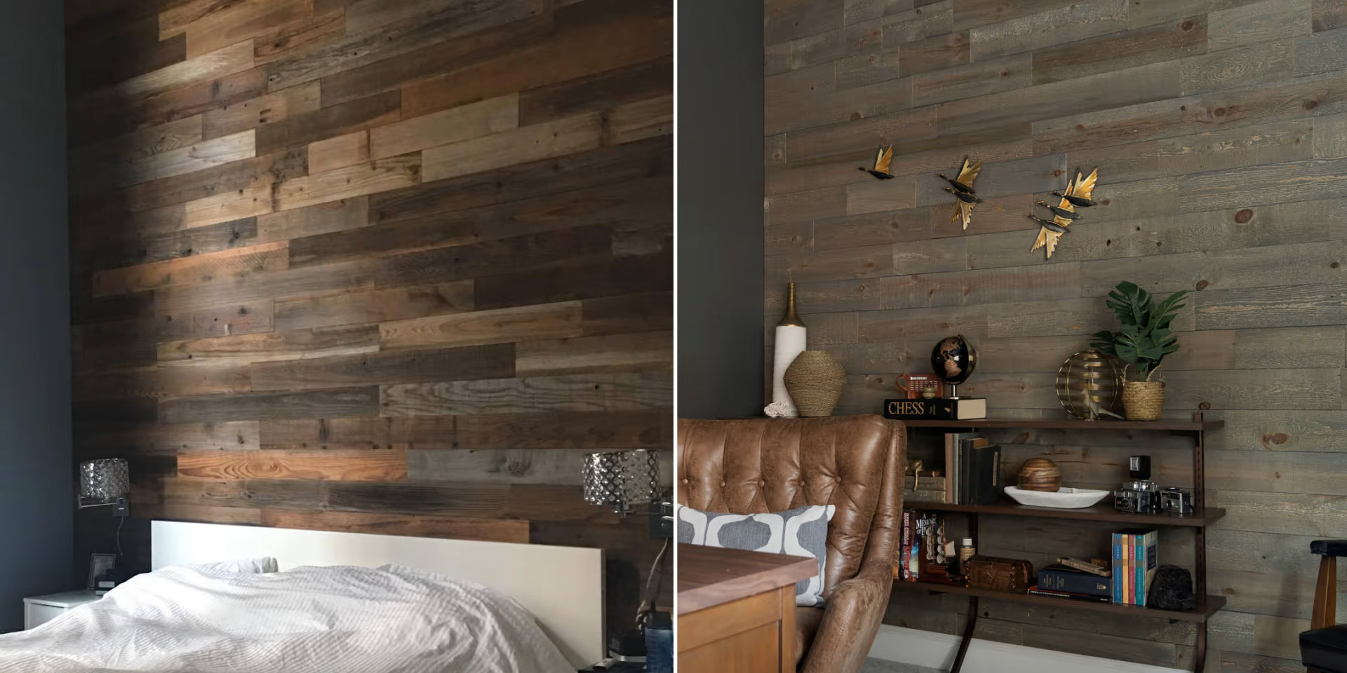
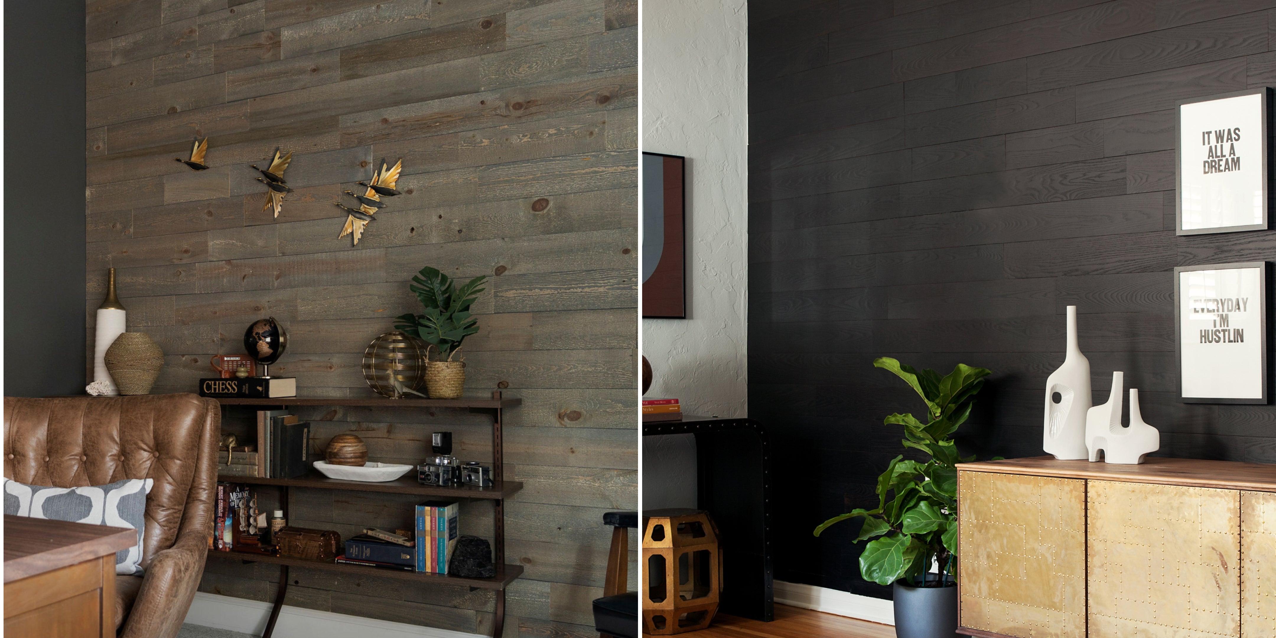
Dark paint colors coupled with natural wood trim add depth and create an intimate ambiance that’s hard to match. A classic example of this design technique in action involves using a black or near-black shade like Sherwin Williams Inkwell.
Sherwin Williams Inkwell is a deep, saturated color that offers a striking contrast against the texture of natural wood. It’s perfect for crafting an impactful statement wall or even to transform entire rooms.
Incorporating blues and greens into your design palette can provide a vibrant yet soothing counterpoint to the earthy tones present in natural wood. Cool tone paint colors offer almost endless possibilities for expressing your creativity.
Muted green shades mirror nature’s own color schemes, while providing a tranquil backdrop for existing features. Consider mossy greens which have enough gray undertones to balance out their vibrancy without losing character.
On the other hand, cool blue hues bring to mind serene landscapes like calm bodies of water. When used alongside darker woods, these colors create dynamic contrasts that are visually appealing yet not overwhelming.
Whatever colors you choose, it’s important to strike a good balance of light and dark. Too many light colors can make rooms look clinical, while hefty amounts of dark tones lose their inviting appeal.
Pro-tip: If your existing decor is on the warmer side, consider greige or taupe to balance out these undertones.
Natural tones like white, gray, and beige (and greige!) often pair well with natural wood. They excel at highlighting the warmth of natural wood planks without overpowering them.
On the other hand, darker hues like black and slate can create a dramatic contrast against lighter decor.
Pastel shades work wonderfully with light natural wood. Soft pinks, sky blue, mint green, or even lavender can enhance its beauty.
A classic choice for natural wood cabinets is white. This gives them a crisp, clean look, which contributes to a bright kitchen perfect for cooking.
Enhancing the beauty of natural wood trim in a home is an art. It’s about finding the perfect balance where paint colors and existing wood coexist seamlessly. White walls with wood trim offer a classic, clean look. Gray and greige paints are game-changers for toning down warm woods. And darker hues, like Inkwell and black are perfect for statement walls.
Ready to take interior design to the next level? Stikwood’s selection of natural wood planks complement virtually any color palette. Browse our collection of easy-to-install reclaimed wood planks here.

Your cart is currently empty.
Start Shopping
Introducing our easy-to-use visualizer tool that allows you to see every color and finish of Stikwood on your own walls, with the touch of a button.